Anessa Tam
Explore
Home
Work
Contact
Connect
Behance
WILLIAMS SONOMA
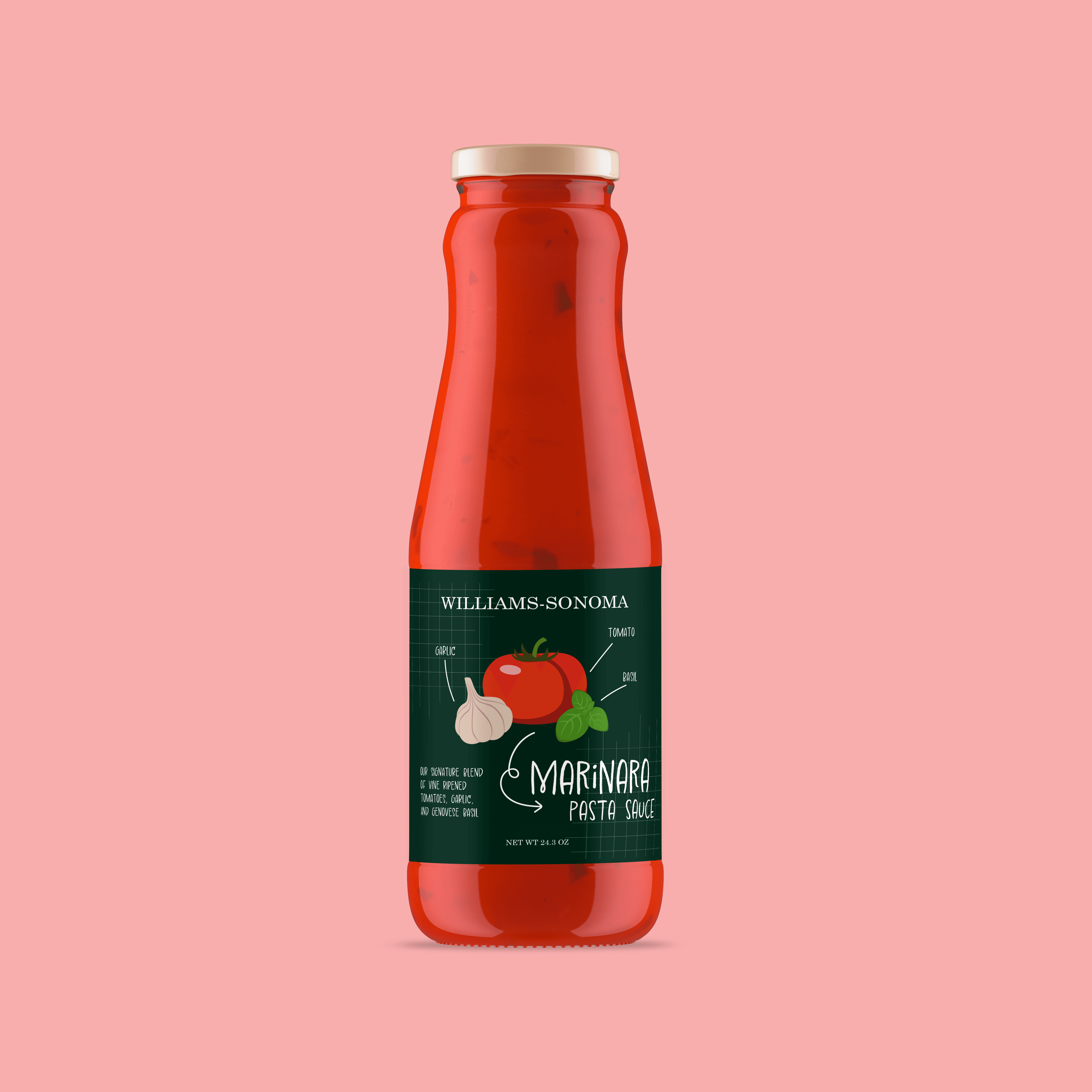
Williams Sonoma is a premium American retailer of high-quality kitchenware, cookware, and gourmet foods. Founded by Chuck Williams in 1956, it represents the company's roots and remains its most iconic brand, serving as a go-to destination for culinary enthusiasts, professional chefs, and home cooks alike. Over the decades, Williams Sonoma evolved from a specialty store into a lifestyle brand that celebrates not just cooking, but the joy of gathering, entertaining, and living well at home.
YEAR
2023
PROJECT
Branding
Packaging
Typography
OBJECTIVE
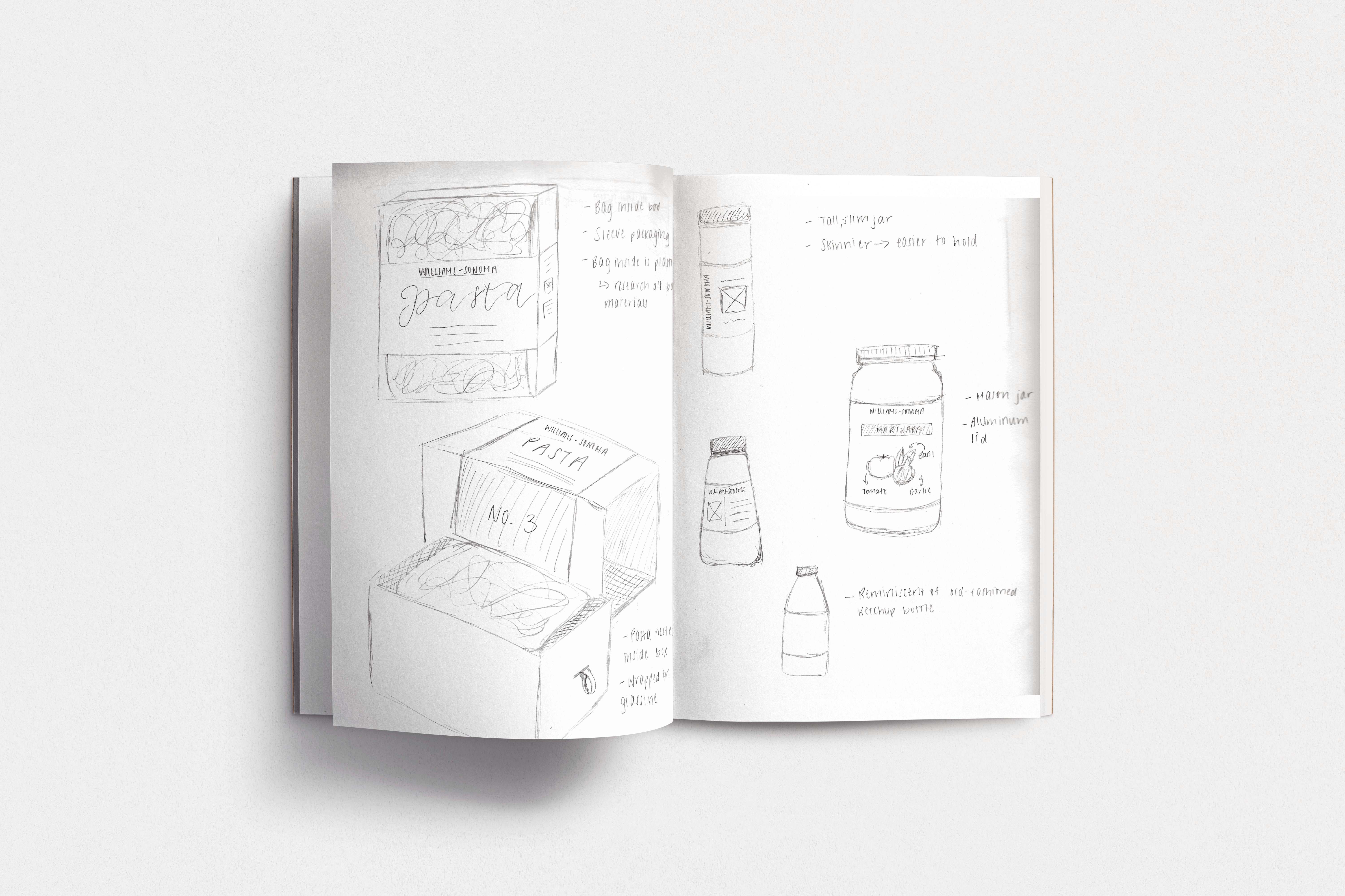
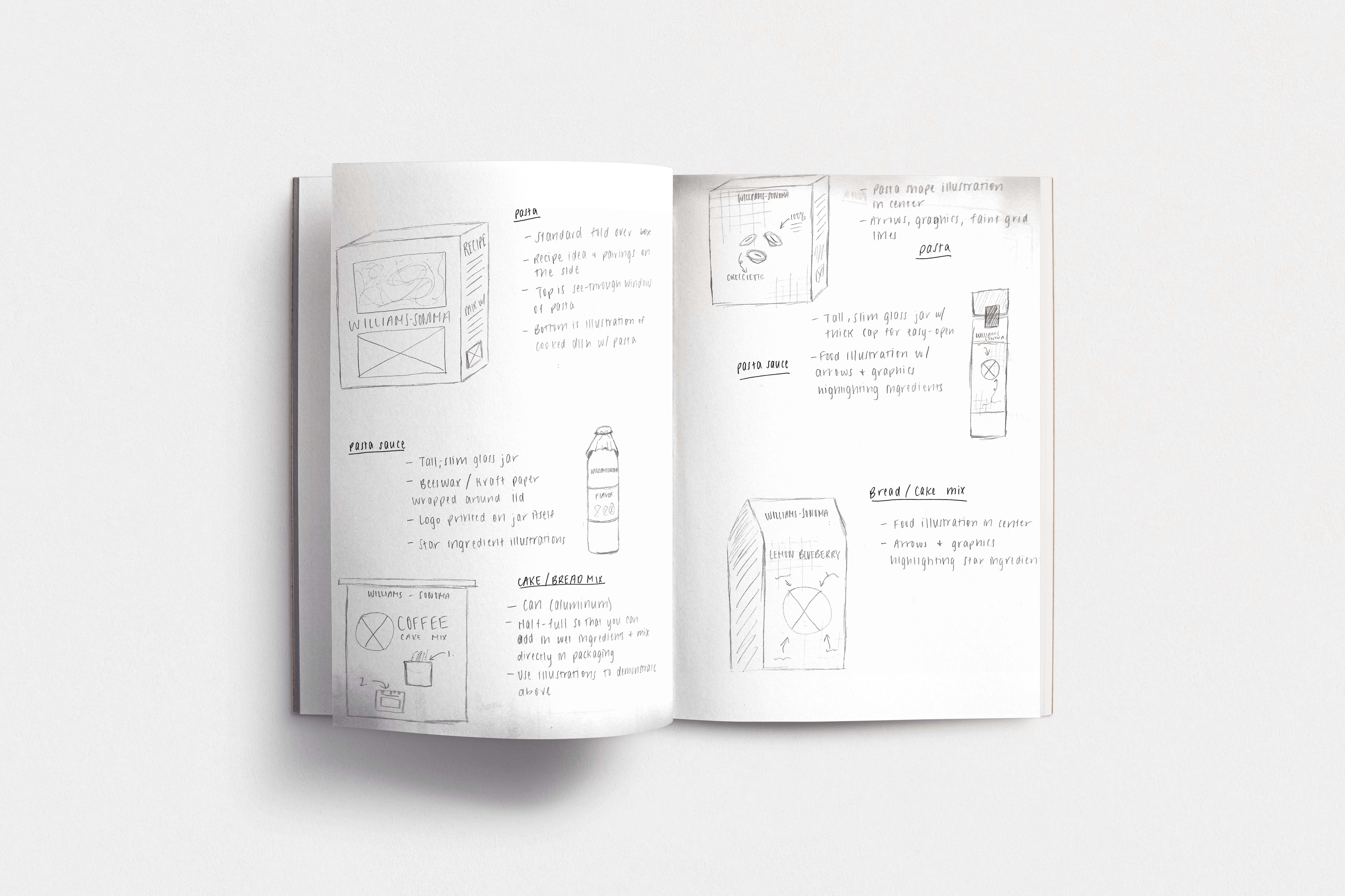
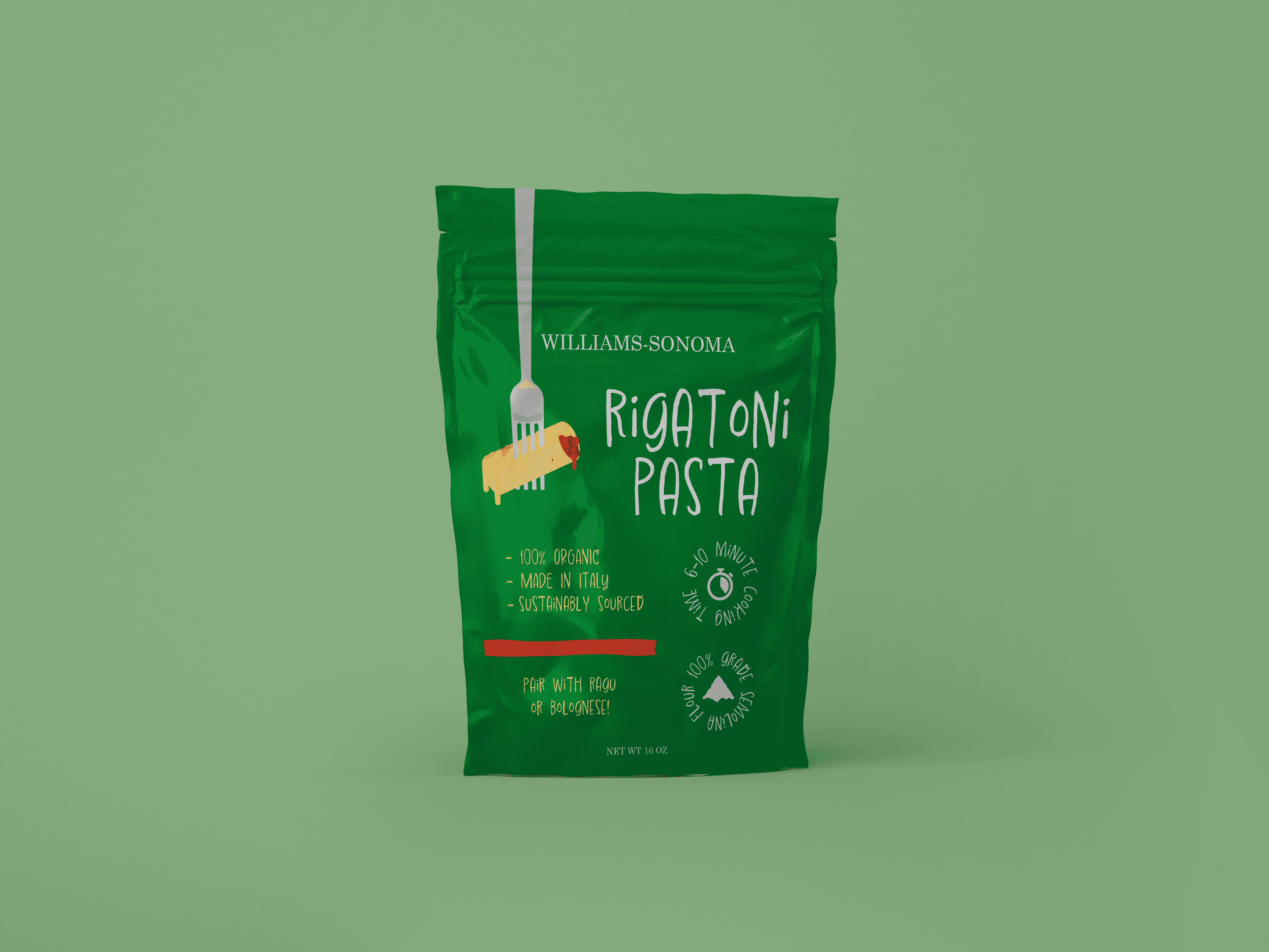
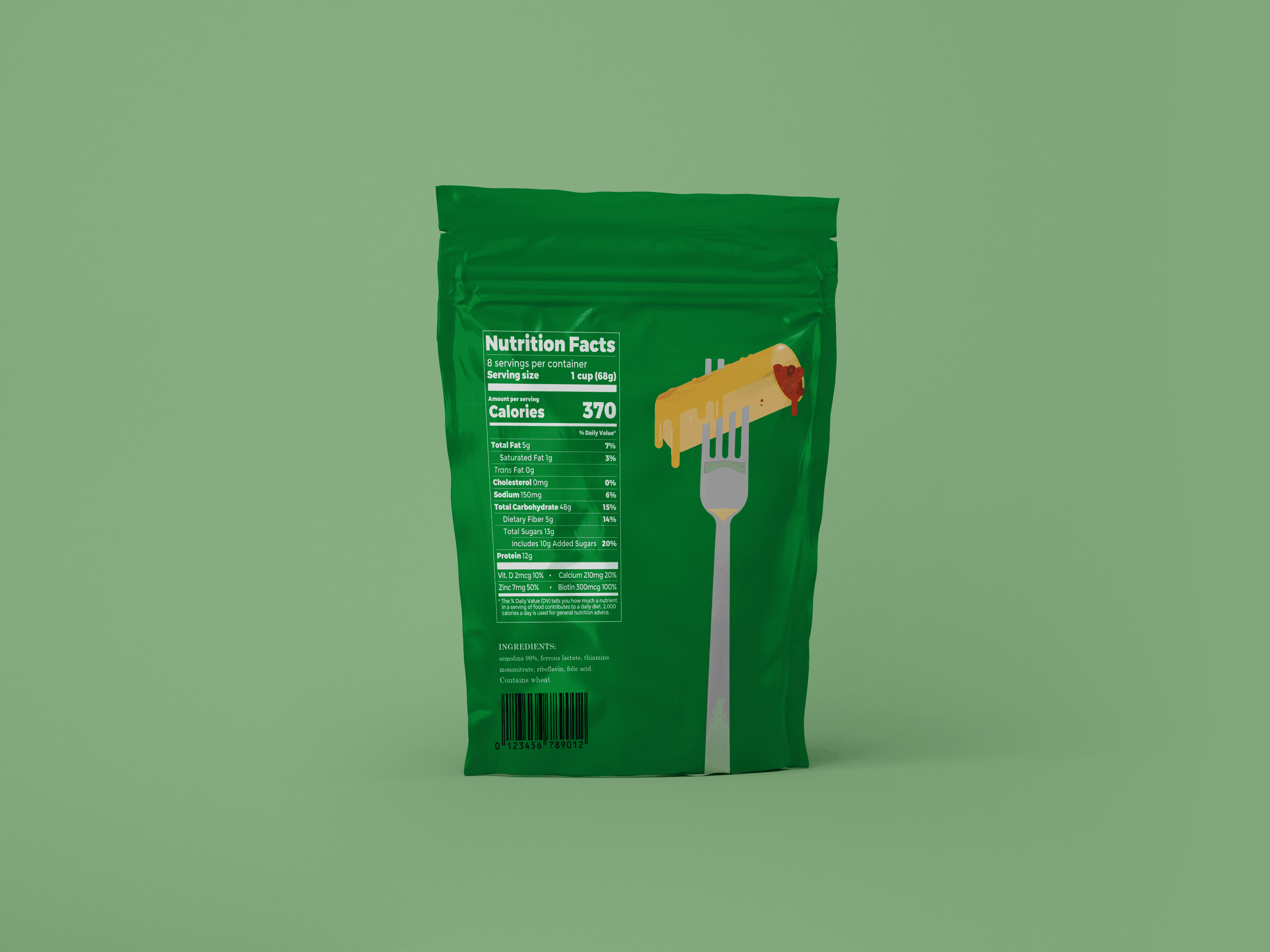
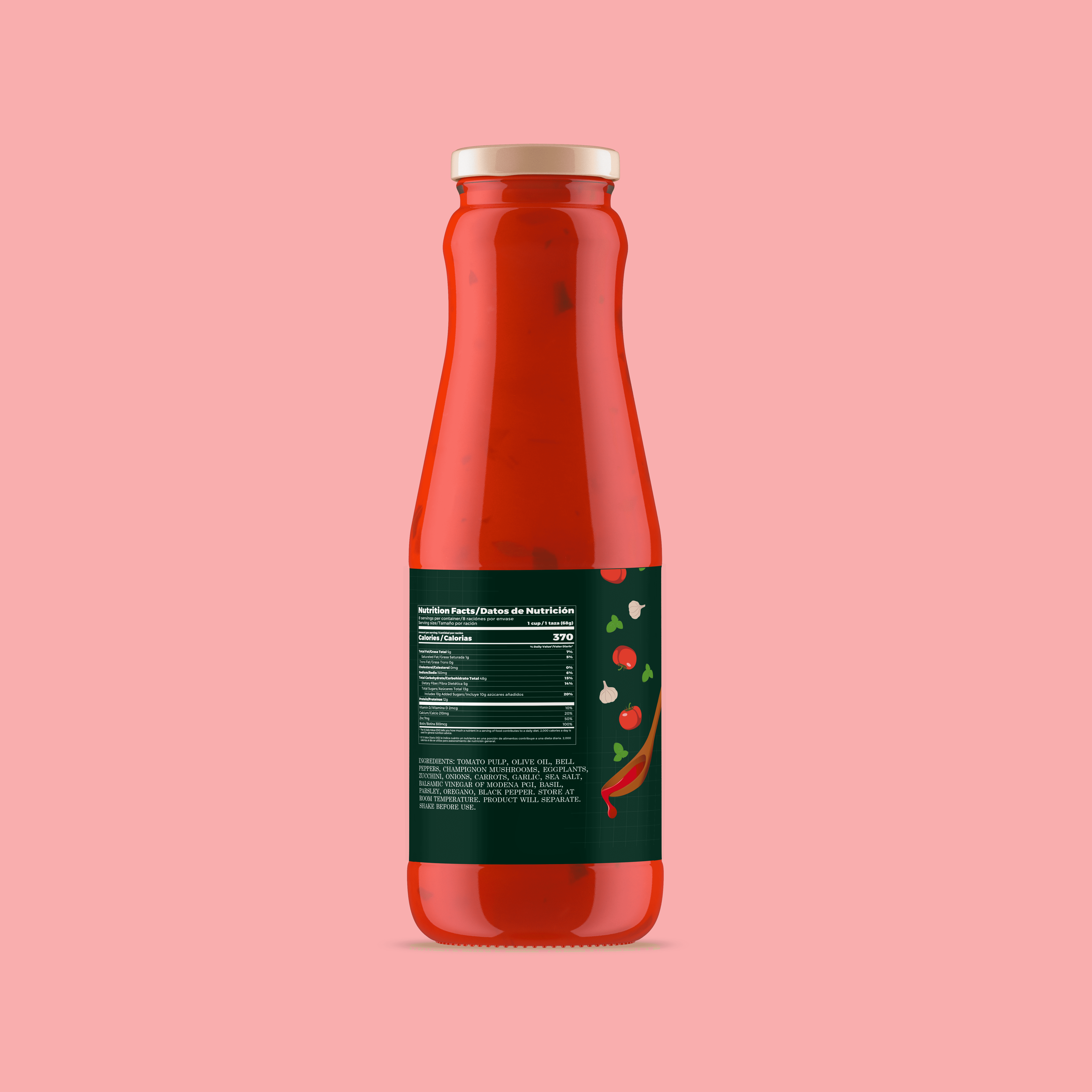
Reimagine the packaging for three food products sold at Williams Sonoma by introducing a simpler, more playful visual language. While the original branding leans toward a more premium, traditional aesthetic, this redesign aims to make the products feel more approachable and budget-friendly—appealing to a broader audience without sacrificing quality.
APPROACH
The redesigned packaging incorporates simple and fun illustrations, a quirky, hand-lettered typeface, and vibrant accent colors. By stripping away ornate elements and focusing on clear hierarchy and visual warmth, the packaging invites a wider audience—including younger consumers and budget-conscious shoppers—into the Williams Sonoma experience. In addition, all three packaging designs are re-sealable.