Anessa Tam
Explore
Home
Work
Contact
Connect
Behance
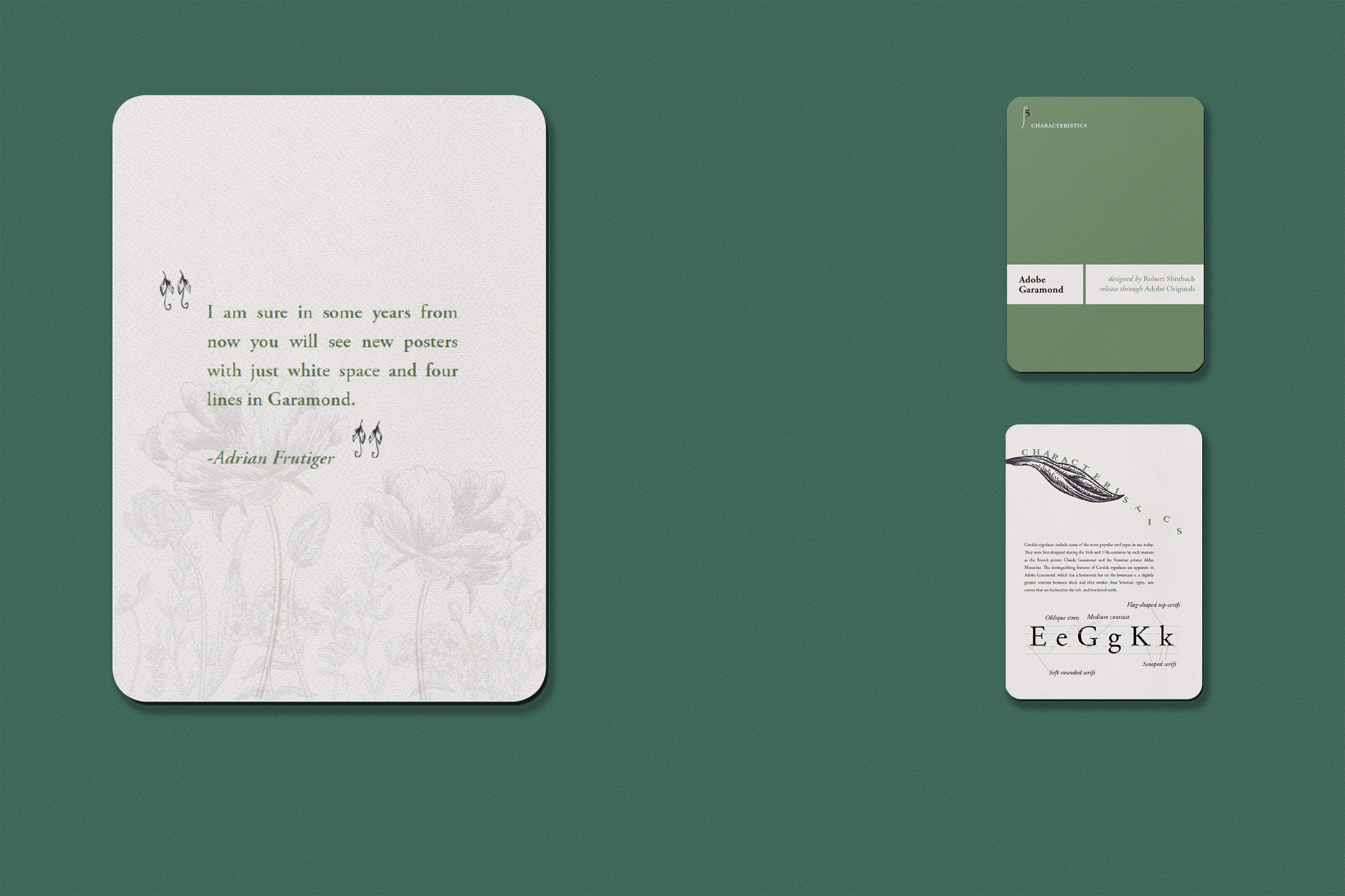
ADOBE GARAMOND CARDS
Adobe Garamond is a digital typeface designed by Robert Slimback in 1989 for Adobe Systems. It is based on the Garamond typefaces of the 16th century, particularly those created by Claude Garamond and later revived by Jean Jannon in the 17th century. It is an old-style serif typeface known for its elegance, readability, and classical proportions. It features a modest contrast between thick and thin strokes and includes serifed ascenders and diagonal stress, making it well-suited for book and editorial design.
YEAR
2022
PROJECT
Visual System
Print & Collateral
Typography
OBJECTIVE
Design a cohesive set of eight educational cards centered around the Adobe Garamond typeface. Each card is crafted to explore and visually communicate a different facet of the typeface—from it's historical origins and designer to its anatomy, defining characteristics, and typographic range.
APPROACH
A unifying botanical theme and sage green colorway was chosen to reflect the elegance and timeless beauty of Adobe Garamond. The delicate floral illustrations mirror the typeface's organic curves and historical roots while allowing the letterforms to take center stage. The design emphasizes clarity, cohesion, and a tactile, print-inspired experience, making the information both accessible and visually engaging.